Global Themes
Global Themes provide a central place to change colors throughout the shader. When configured, you can set any Color properties across the Material to instead use your defined Theme Color.
This allows you to create animations that can change all Color linked to your Theme Color all in one go.
Usage in the Shader
To use Global Themes in the Shader, set the Colors you prefer to use in each Theme Color.
Then, set whichever Color property you wish to use a Global Theme by selecting the dropdown located next to the Color property. The dropdown will look something like this:
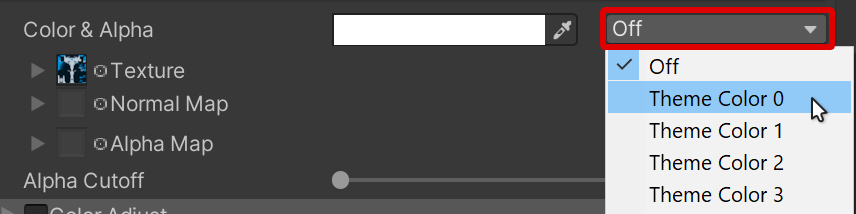
Example of the Theme Color dropdown located next to a Color property.
When set, this will override the Color with whichever Color is configured in the selected Theme Color.
Material Properties
The following below are the properties that are available in Global Themes. You can have a maximum of 4 Theme Colors per Material.
Each of the 4 Global Themes (0, 1, 2, 3) have the following unique options listed below. They are independent of each other, and are selected across the shader based on the identifying Theme Color slot.
Theme Color
- Type
- HDR Color
Color to use for Theme Color.
Color Space
- Type
- Dropdown
- Options
- OKLabdefaultHSV
Choice of Color Space to use for the Hue Shift.
Learn about the difference of Color Spaces as documented in Color Adjust.
Shift Speed
- Type
- Float
How much to constantly shift the Theme Color Hue with time. A value of 1 will result in a full hue shift cycle every 20 seconds.
Hue Shift
- Type
- Range
- Range
- 0to1
How much to shift the Theme Color around the Hue Circle. This value is circular, and will have the same result at 0 and 1.
This functions in the same fashion as Color Adjust's Hue Shift slider.
Saturation Style
- Type
- Dropdown
- Options
- Saturation Value (old)Saturation Brightnessdefault
Selects the type of Saturation or Brightness style to use.
This dropdown is provided for backwards-compatibility with both old 9.3 and newer 10.0 animation setups. The setting of this dropdown will affect what values are exposed here.
Saturation Value (old)will use the old system with the Saturation Adjust and Value Adjust sliders exposed.Saturation Brightnesswill use the NEW system with modern Saturation and Brightness sliders exposed.
Saturation
- Type
- Range
- Range
- -1to10
- Default
- 0
- Shown when
Saturation Style is set to
Saturation Brightness
Adjusts the saturation of the Theme Color.
A value of -1 will make the Theme Color fully de-saturate (grayscale). A value of 0 will not alter the color at all. A value greater than 0 will increase the saturation of the color.
This is implemented as a lerp between the base color and a grayscale version of the base color.
Brightness
- Type
- Range
- Range
- -1to2
- Default
- 0
- Shown when
Saturation Style is set to
Saturation Brightness
Adjusts the brightness of the Theme Color.
This increases or decreases brightness directly on top of the Theme Color, without regard for it's hue or tone.
Saturation Adjust
- Type
- Range
- Range
- -1to1
- Default
- 0
- Shown when
Saturation Style is set to
Saturation Value (old)
Adjusts the Saturation of the Theme Color.
A value of -1 will make the Theme Color fully de-saturate (grayscale). A value of 0 will not alter the color at all. A value greater than 0 will increase the saturation of the Theme Color.
Value Adjust
- Type
- Range
- Range
- -1to1
- Default
- 0
- Shown when
Saturation Style is set to
Saturation Value (old)
Adjusts the brightness value of the Theme Color on top, without regard for it's Hue or Tone.